
Are the colours very bad?
I finally began working on my calligraphy page again a few days ago, and have come up with the following:
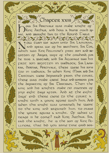
I did the outlining and the colouring on Adobe Photoshop, just to see how the page would look. I want to do the final inking and colouring by hand, though. I started working on a practice page today, and it's going swimmingly (comme sur des roulettes, as it were).
That said, I'm not quite happy with the design, especially the border to the left and right of the text. I think it would have been worthwhile to include more detail, rather than having large, simple shapes. The spacing is off, too, and I'll have to see how I'll do the colouring (i.e. which colours I'll use, and whether I'll use ink, paint, or something else entirely).
Anyway, I do like the bottom part of the border. Especially the lion. :o) I used several images off the internet as references. Here they are (from Genlinks, Marci's Hum 302 Website, and Highlander Celtic Stamps):


At least I didn't use that shade of green, eh?
To clumsily change the subject, I've also been learning some JavaScript, which is diverting (divertido!). It isn't too difficult either, since I learned a fair amount of Java during my second year of university. (I think my Computer Science class — a first year course — was the only one I didn't fail.) There are differences between Java and JavaScript, of course, but it helps to be familiar with general concepts. It also helps to have plenty of reference books at my disposal.
I was learning JavaScript in the first place because my brothers are taking Informatik (Computer Science) in school, and their class has just finished a JavaScript unit. I was trying to be of help. :o]
Note: I have finally begun linking my flickr images as the flickr Terms of Service demand, so I will stop mentioning flickr in notes like this one.
posted by tvhtoo @ 20:27
0 comments
![]()
![]()
0 Comments:
Post a Comment
<< Home